
Emergency Medical
System (EMS) App
Emergency Medical
System (EMS) App
Emergency Medical
System (EMS) App
bridging the UX gap between users and emergency services
bridging the UX gap between users and emergency services
bridging the UX gap between users and emergency services
Emergency Medical
System (EMS) App
bridging the UX gap between users and emergency services
Project
Project
UX/UI
UX/UI
Industry
Industry
Healthcare
Healthcare
Date
Date
Feb - 2025
Feb - 2025
Duration
Duration
3 - 5 weeks
3 - 5 weeks
Overview.
Overview.
Overview.
When every second counts, design makes the difference.
When every second counts, design makes the difference.
When every second counts, design makes the difference.
My role
My role
Led UX research and UI design, conducted field studies, designed presentation visuals, built UI components, and guided a 4-member team through iterative design sprints.
Led UX research and UI design, conducted field studies, designed presentation visuals, built UI components, and guided a 4-member team through iterative design sprints.
Led UX research and UI design, conducted field studies, designed presentation visuals, built UI components, and guided a 4-member team through iterative design sprints.
Team
Team
Myself (UX Researcher + UI Designer),
1 UX Designer, 2 UI Designers
Myself (UX Researcher + UI Designer),
1 UX Designer, 2 UI Designers
Myself (UX Researcher + UI Designer),
1 UX Designer, 2 UI Designers
Duration
Duration
3–5 Weeks
Design sprint + Iterations
3–5 Weeks
Design sprint + Iterations
3–5 Weeks
Design sprint + Iterations
01. Context
01. Context
01. Context
In India, most emergency medical apps fail the people who need them most.
We discovered that accessibility wasn’t an edge case it was a crisis.
In India, most emergency medical apps fail the people who need them most.
We discovered that accessibility wasn’t an edge case it was a crisis.
In India, most emergency medical apps fail the people who need them most.
We discovered that accessibility wasn’t an edge case it was a crisis.
In India, most emergency medical apps fail the people who need them most.
We discovered that accessibility wasn’t an edge case it was a crisis.
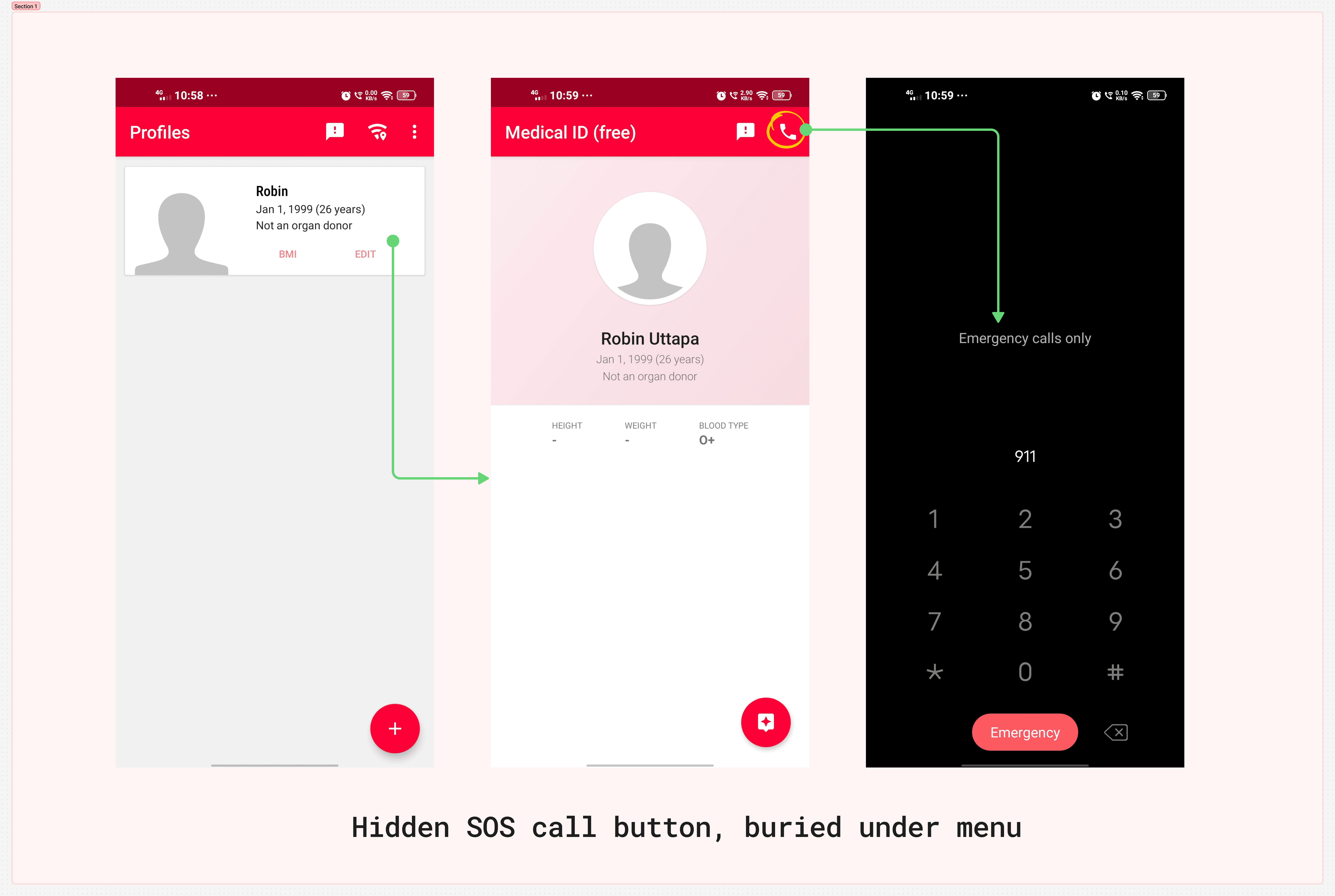
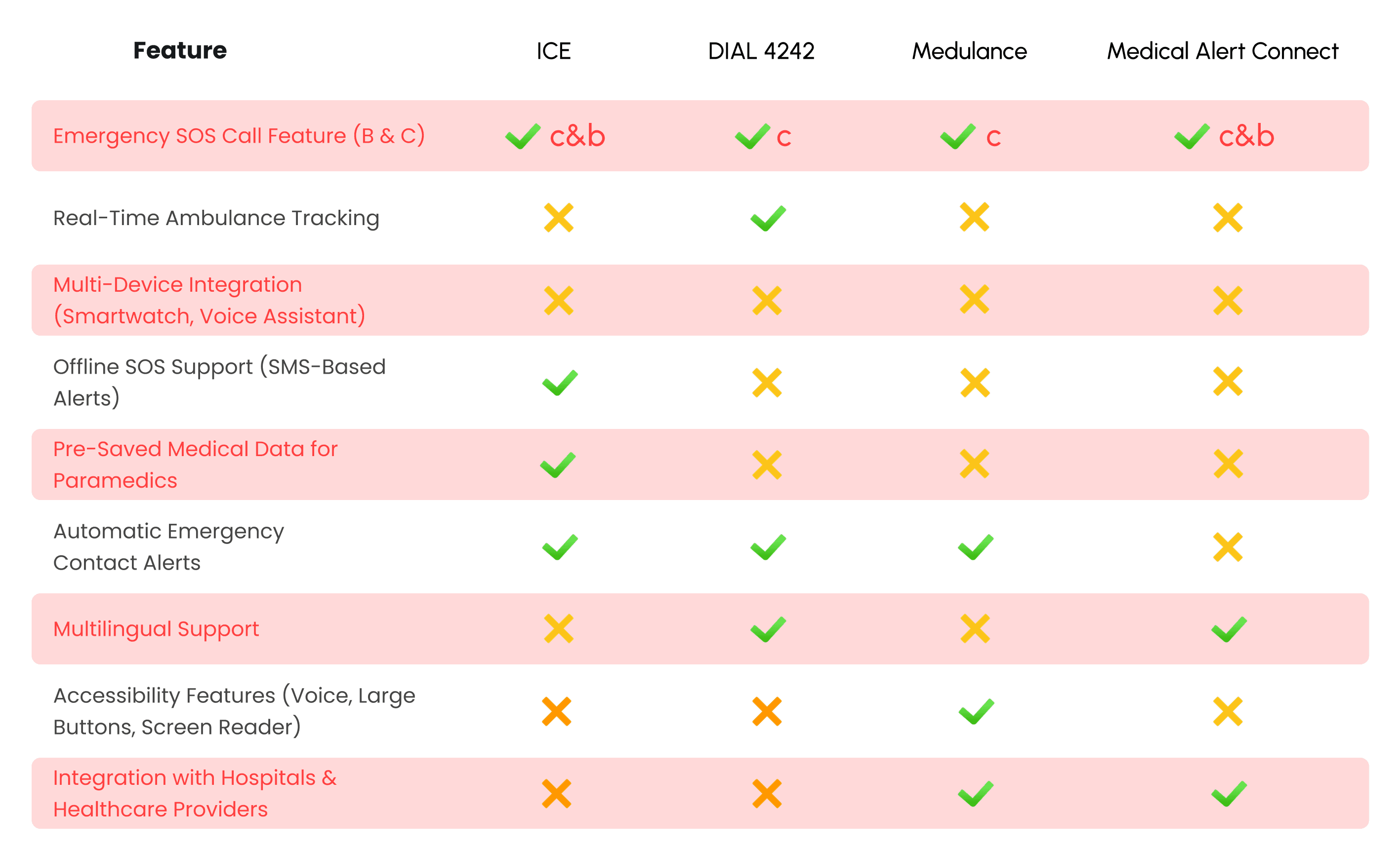
Our audit of the top 5 EMS apps revealed common UX flaws: poor accessibility, no offline fallback, and inconsistent feedback after SOS activation.
Our audit of the top 5 EMS apps revealed common UX flaws: poor accessibility, no offline fallback, and inconsistent feedback after SOS activation.
Our audit of the top 5 EMS apps revealed common UX flaws: poor accessibility, no offline fallback, and inconsistent feedback after SOS activation.
We realized this wasn’t about new features, it was about redesigning trust and usability at a human level.
We realized this wasn’t about new features, it was about redesigning trust and usability at a human level.
We realized this wasn’t about new features, it was about redesigning trust and usability at a human level.

View Actual Case study
View Actual Case study
View Actual Case study
02. Backstory
02. Backstory
02. Backstory
02. Backstory
We redesigned the EMS experience through two user lenses:
We redesigned the EMS experience through two user lenses:
Aisha, a 28-year-old schoolteacher living with partial hand paralysis, and Rohan, a 30-year-old marketing executive recovering from a road accident. Together, they represent the emotional and functional extremes of the problem: accessibility and reliability.
Aisha, a 28-year-old schoolteacher living with partial hand paralysis, and Rohan, a 30-year-old marketing executive recovering from a road accident. Together, they represent the emotional and functional extremes of the problem: accessibility and reliability.
Aisha, a 28-year-old schoolteacher living with partial hand paralysis, and Rohan, a 30-year-old marketing executive recovering from a road accident. Together, they represent the emotional and functional extremes of the problem: accessibility and reliability.
India’s emergency response infrastructure is complex multiple apps, inconsistent protocols, unreliable coverage.
In early desk research, we analyzed public reports from the National Health Mission, NIST, and WHO on emergency communication barriers.
India’s emergency response infrastructure is complex multiple apps, inconsistent protocols, unreliable coverage.
In early desk research, we analyzed public reports from the National Health Mission, NIST, and WHO on emergency communication barriers.
India’s emergency response infrastructure is complex multiple apps, inconsistent protocols, unreliable coverage.
In early desk research, we analyzed public reports from the National Health Mission, NIST, and WHO on emergency communication barriers.
One key finding: the UX of emergency interfaces directly influences response time, especially for users under stress or with limited mobility.
One key finding: the UX of emergency interfaces directly influences response time, especially for users under stress or with limited mobility.
One key finding: the UX of emergency interfaces directly influences response time, especially for users under stress or with limited mobility.
One key finding: the UX of emergency interfaces directly influences response time, especially for users under stress or with limited mobility.
finding answers Through
finding answers Through
finding answers Through
Primary Research
Primary Research
Primary Research


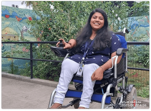
Aisha - schoolteacher
Aisha - schoolteacher
Aisha - schoolteacher
We began with empathy.
We began with empathy.
We began with empathy.
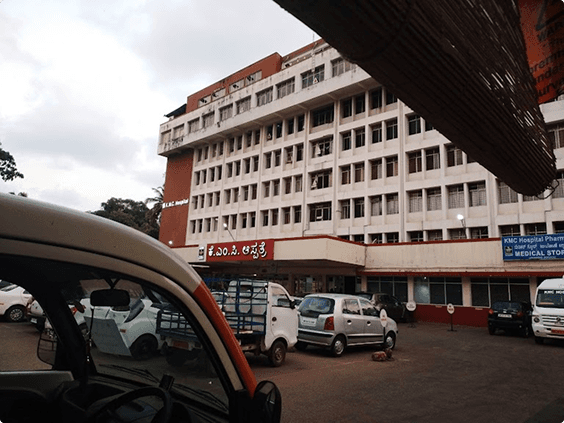
During ethnographic research, we observed how users actually tried to reach help. Aisha showed us her phone: she had to unlock, open the app, locate a small icon, and tap twice all using her left hand. She said, “By the time I do that, I’ve already lost hope.”
Rohan’s issue was technological but equally emotional. He described the anxiety of “watching nothing happen” as he waited for an ambulance, no movement, no confirmation.
During ethnographic research, we observed how users actually tried to reach help. Aisha showed us her phone: she had to unlock, open the app, locate a small icon, and tap twice all using her left hand. She said, “By the time I do that, I’ve already lost hope.”
Rohan’s issue was technological but equally emotional. He described the anxiety of “watching nothing happen” as he waited for an ambulance, no movement, no confirmation.
During ethnographic research, we observed how users actually tried to reach help. Aisha showed us her phone: she had to unlock, open the app, locate a small icon, and tap twice all using her left hand. She said, “By the time I do that, I’ve already lost hope.”
Rohan’s issue was technological but equally emotional. He described the anxiety of “watching nothing happen” as he waited for an ambulance, no movement, no confirmation.
Our early field audit proved it: most EMS apps were designed for ideal conditions, not for the chaotic, low-connectivity, high-adrenaline scenarios where they’re truly needed.
Our early field audit proved it: most EMS apps were designed for ideal conditions, not for the chaotic, low-connectivity, high-adrenaline scenarios where they’re truly needed.
Our early field audit proved it: most EMS apps were designed for ideal conditions, not for the chaotic, low-connectivity, high-adrenaline scenarios where they’re truly needed.
Our early field audit proved it: most EMS apps were designed for ideal conditions, not for the chaotic, low-connectivity, high-adrenaline scenarios where they’re truly needed.
03. Research & Discovery
03. Research & Discovery
03. Research & Discovery
We began with mixed-method research combining qualitative empathy work with quantitative validation.
We began with mixed-method research combining qualitative empathy work with quantitative validation.
We began with mixed-method research combining qualitative empathy work with quantitative validation.
Primary Research Insights:
Primary Research Insights:
Accessibility challenges (fine motor, visual impairment, or stress tremors) caused mis-taps or slow activations.
Lack of sensory feedback (sound/vibration/voice) increased user anxiety.
Poor connectivity and no offline SOS pathways created dead zones in emergencies.
Users equated reliability with emotional reassurance — “I just need to know someone’s coming.”
Accessibility challenges (fine motor, visual impairment, or stress tremors) caused mis-taps or slow activations.
Lack of sensory feedback (sound/vibration/voice) increased user anxiety.
Poor connectivity and no offline SOS pathways created dead zones in emergencies.
Users equated reliability with emotional reassurance — “I just need to know someone’s coming.”
Accessibility challenges (fine motor, visual impairment, or stress tremors) caused mis-taps or slow activations.
Lack of sensory feedback (sound/vibration/voice) increased user anxiety.
Poor connectivity and no offline SOS pathways created dead zones in emergencies.
Users equated reliability with emotional reassurance — “I just need to know someone’s coming.”
Primary Research Insights:
Secondary Research:
Secondary Research:
Secondary Research:
We studied emergency design systems from FEMA, Apple Health, and Sweden’s SOS Alarm to benchmark data feedback loops and fallback logic.
We also reviewed case studies on HCI under stress (MIT Human Factors Lab) to understand how panic reduces fine-motor accuracy, shaping our approach to one-tap and voice-first design.
We studied emergency design systems from FEMA, Apple Health, and Sweden’s SOS Alarm to benchmark data feedback loops and fallback logic.
We also reviewed case studies on HCI under stress (MIT Human Factors Lab) to understand how panic reduces fine-motor accuracy, shaping our approach to one-tap and voice-first design.
We studied emergency design systems from FEMA, Apple Health, and Sweden’s SOS Alarm to benchmark data feedback loops and fallback logic.
We also reviewed case studies on HCI under stress (MIT Human Factors Lab) to understand how panic reduces fine-motor accuracy, shaping our approach to one-tap and voice-first design.
The real UX problem isn’t pressing SOS, it’s believing it worked.
The real UX problem isn’t pressing SOS, it’s believing it worked.
The real UX problem isn’t pressing SOS, it’s believing it worked.
04. Defining the Problem
04. Defining the Problem
04. Defining the Problem
To translate empathy into action, we created journey maps for Aisha and Rohan under emergency conditions.
To translate empathy into action, we created journey maps for Aisha and Rohan under emergency conditions.
To translate empathy into action, we created journey maps for Aisha and Rohan under emergency conditions.
Each emotional curve showed the same cycle: Panic → Confusion → Hope → Relief. But between panic and hope lay a massive usability void.
Each emotional curve showed the same cycle: Panic → Confusion → Hope → Relief. But between panic and hope lay a massive usability void.
Each emotional curve showed the same cycle: Panic → Confusion → Hope → Relief. But between panic and hope lay a massive usability void.
Aisha’s critical moment: unable to press SOS due to small icons.
Rohan’s critical moment: SOS pressed, but no confirmation or map update.
Aisha’s critical moment: unable to press SOS due to small icons.
Rohan’s critical moment: SOS pressed, but no confirmation or map update.
Aisha’s critical moment: unable to press SOS due to small icons.
Rohan’s critical moment: SOS pressed, but no confirmation or map update.

05. Ideation & Concept Development
05. Ideation & Concept Development
05. Ideation & Concept Development
We ran a design studio session where each team member sketched rapid SOS flows in under 5 minutes. We used Crazy 8s to explore divergent ideas, then consolidated them through Dot Voting.
We ran a design studio session where each team member sketched rapid SOS flows in under 5 minutes. We used Crazy 8s to explore divergent ideas, then consolidated them through Dot Voting.
We ran a design studio session where each team member sketched rapid SOS flows in under 5 minutes. We used Crazy 8s to explore divergent ideas, then consolidated them through Dot Voting.

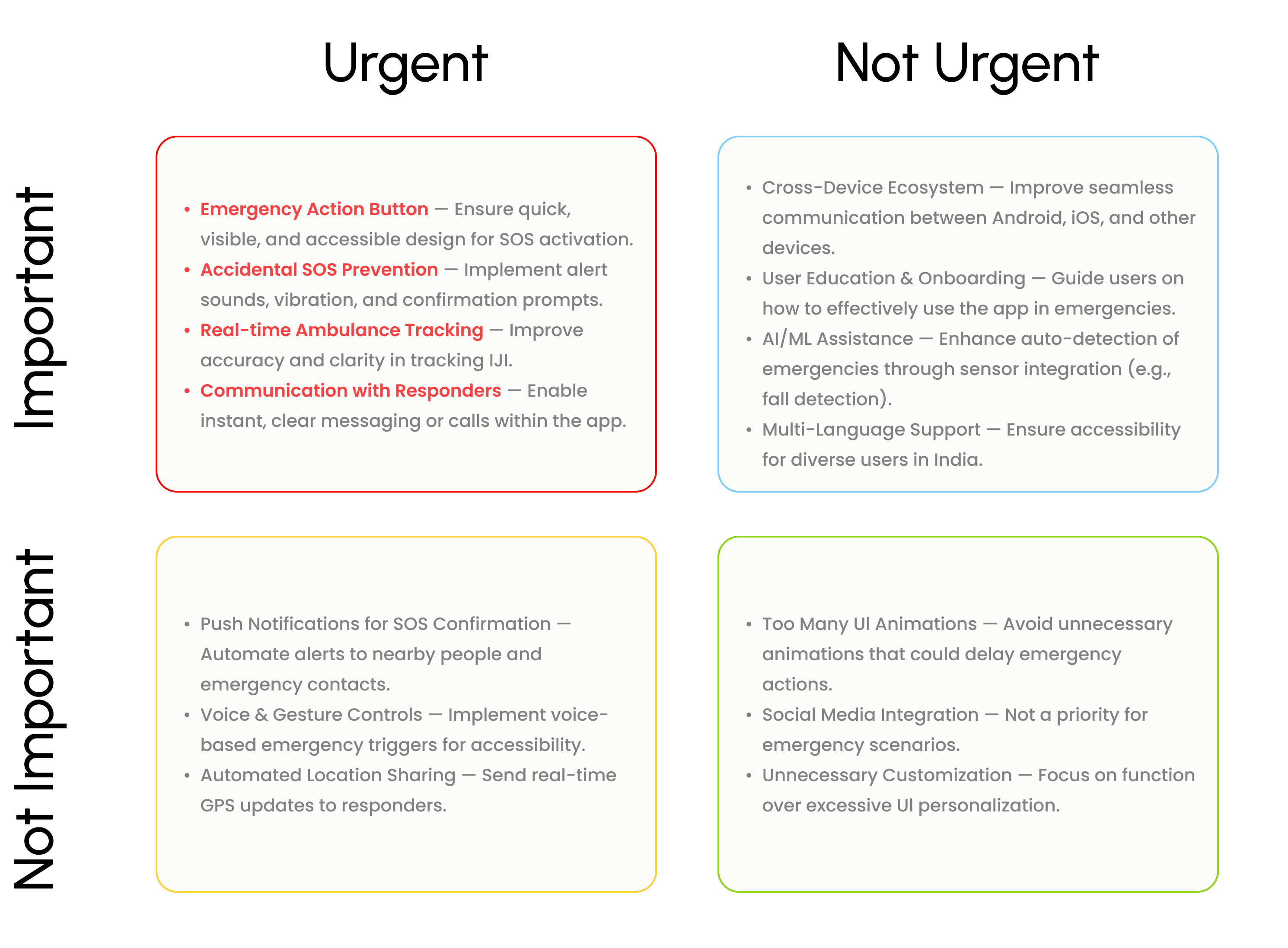
We then mapped each concept through a Eisenhower Matrix to balance design ambition and technical constraints.
We then mapped each concept through a Eisenhower Matrix to balance design ambition and technical constraints.
We then mapped each concept through a Eisenhower Matrix to balance design ambition and technical constraints.
Certainty over Complexity.
Users don’t want options in panic they want assurance.
This inspired the “single-gesture” SOS interface.
Layered Feedback Loops.
Haptic, visual, and auditory feedback combined to confirm success at every step.
Offline-first Architecture.
SOS must work with or without data.
This drove the SMS fallback concept and caching design.
Certainty over Complexity.
Users don’t want options in panic they want assurance.
This inspired the “single-gesture” SOS interface.
Layered Feedback Loops.
Haptic, visual, and auditory feedback combined to confirm success at every step.
Offline-first Architecture.
SOS must work with or without data.
This drove the SMS fallback concept and caching design.
Certainty over Complexity.
Users don’t want options in panic they want assurance.
This inspired the “single-gesture” SOS interface.
Layered Feedback Loops.
Haptic, visual, and auditory feedback combined to confirm success at every step.
Offline-first Architecture.
SOS must work with or without data.
This drove the SMS fallback concept and caching design.

06/1. Testing & Iteration
06/1. Testing & Iteration
06/1. Testing & Iteration
BANG!!!!!!!!!!
Reality check: first prototypes broke in many aspects
BANG!!!!!!!!!!
Reality check: first prototypes broke in many aspects
06/2. Breakthrough Solutions
06/2. Breakthrough Solutions
06/2. Breakthrough Solutions
After multiple iterations, our integrated system emerged
After multiple iterations, our integrated system emerged
After multiple iterations, our integrated system emerged
Smart SOS with Countdown Confirmation. A 5-second delay prevents false triggers while reassuring users via sound
and vibration,Voice & Multi-Device Activation. Trigger SOS via voice. smartwatch. or assistant — seamless accessibility.
Offline SMS Fallback. Auto-sends coordinates + health data when network fails
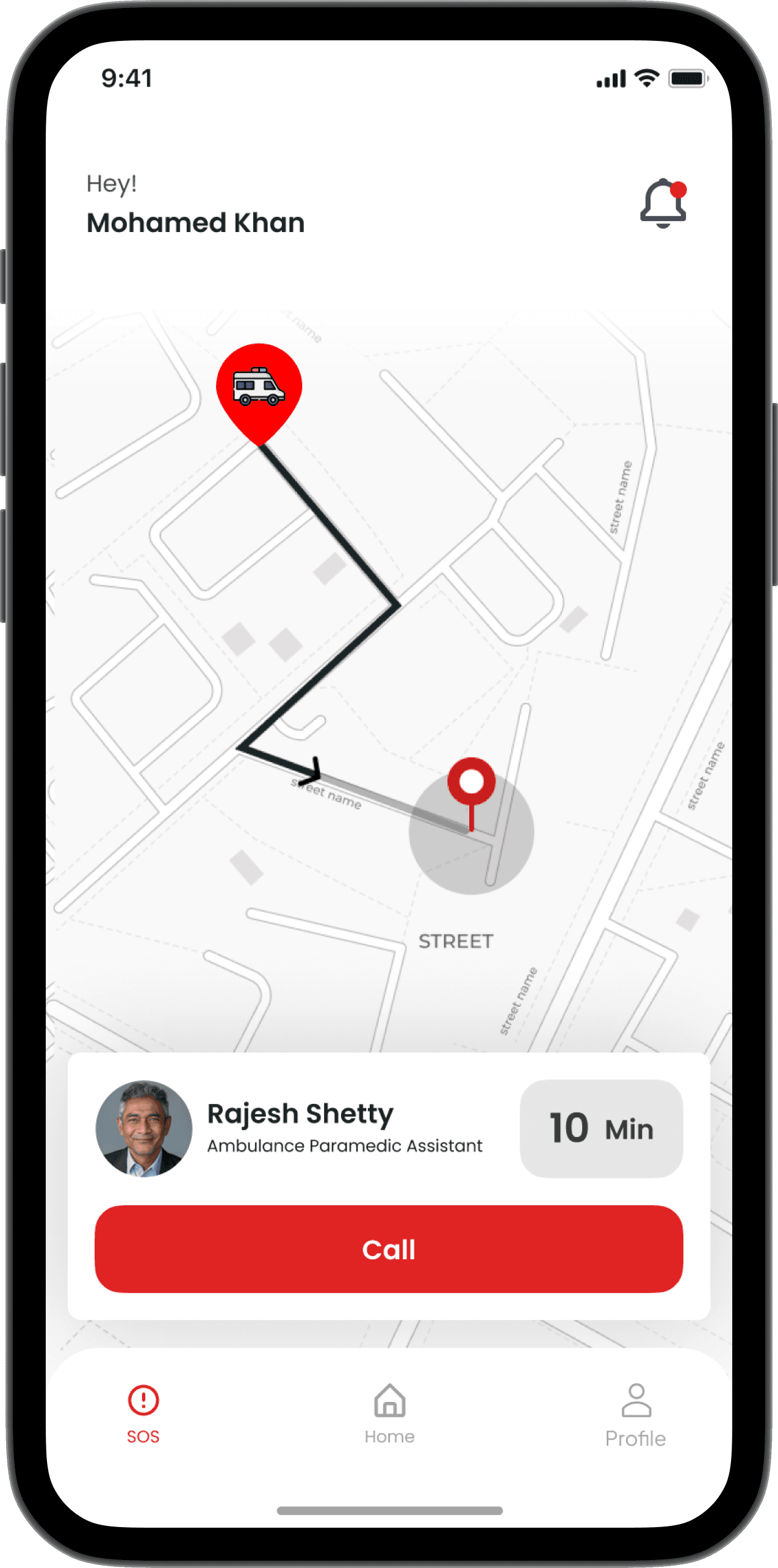
Live Ambulance Tracking. Real-time movement visualization reduces anxiety.
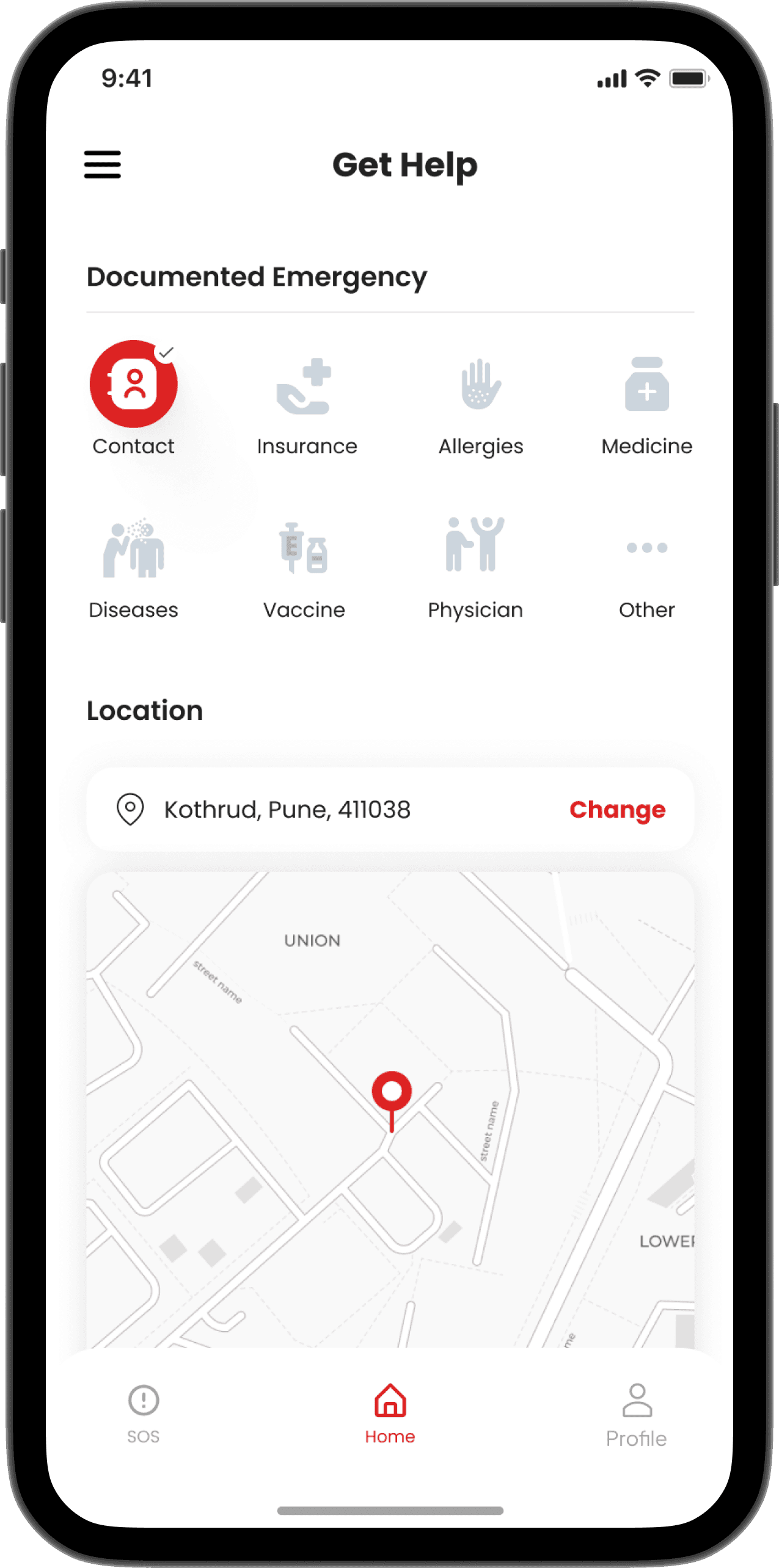
Pre-Saved Health Records. Auto-shared with responders for faster triage.
Smart SOS with Countdown Confirmation. A 5-second delay prevents false triggers while reassuring users via sound
and vibration,Voice & Multi-Device Activation. Trigger SOS via voice. smartwatch. or assistant — seamless accessibility.
Offline SMS Fallback. Auto-sends coordinates + health data when network fails
Live Ambulance Tracking. Real-time movement visualization reduces anxiety.
Pre-Saved Health Records. Auto-shared with responders for faster triage.
Smart SOS with Countdown Confirmation. A 5-second delay prevents false triggers while reassuring users via sound
and vibration,Voice & Multi-Device Activation. Trigger SOS via voice. smartwatch. or assistant — seamless accessibility.
Offline SMS Fallback. Auto-sends coordinates + health data when network fails
Live Ambulance Tracking. Real-time movement visualization reduces anxiety.
Pre-Saved Health Records. Auto-shared with responders for faster triage.
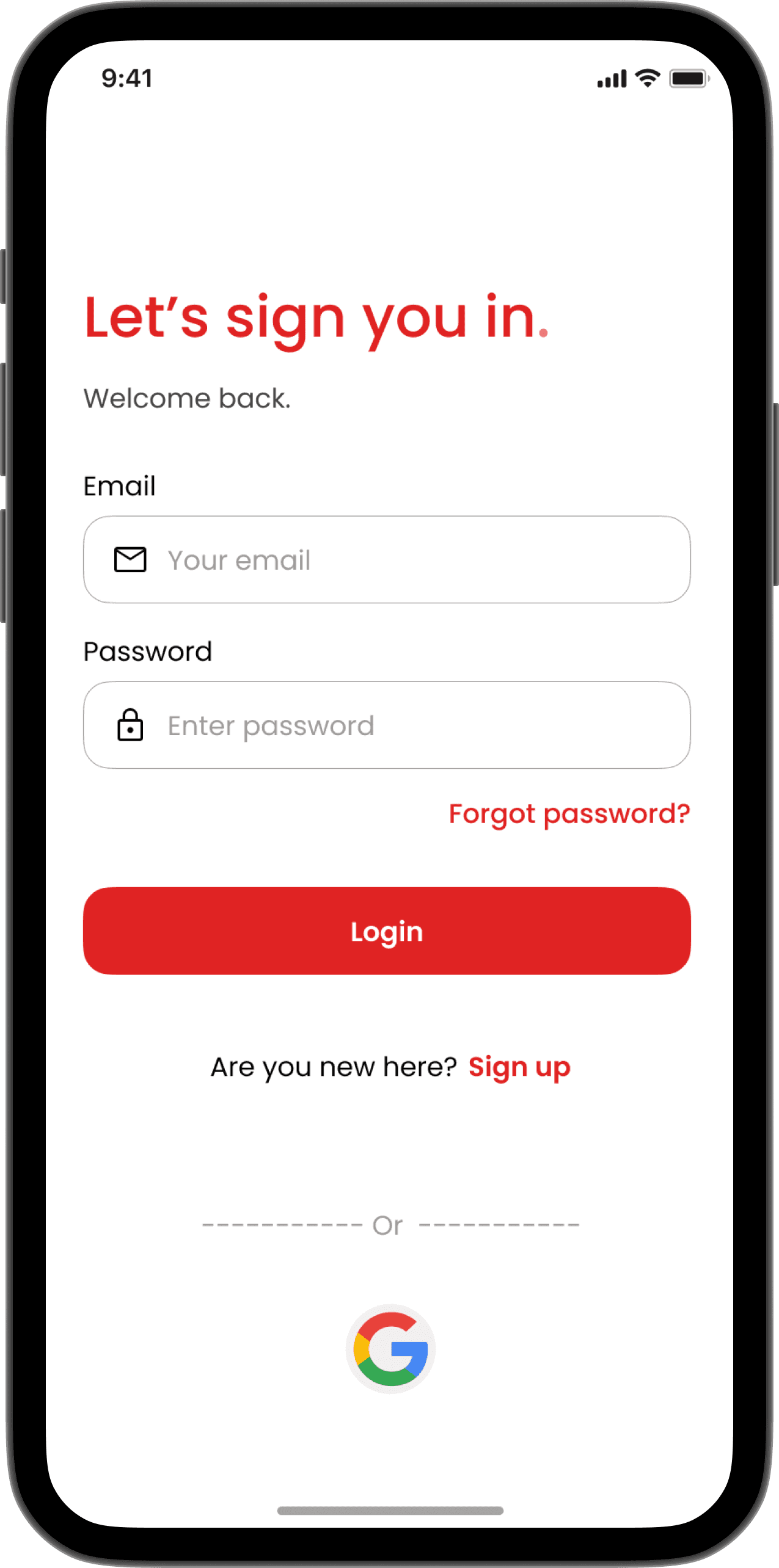
The UI embodies calm urgency a bold red SOS, clear typography, gentle haptics, and heartbeat
animation guiding users from chaos to control.
The UI embodies calm urgency a bold red SOS, clear typography, gentle haptics, and heartbeat
animation guiding users from chaos to control.
The UI embodies calm urgency a bold red SOS, clear typography, gentle haptics, and heartbeat
animation guiding users from chaos to control.
The UI embodies calm urgency a bold red SOS, clear typography, gentle haptics, and heartbeat animation guiding users from chaos to control.





07. Results & Reflection
07. Results & Reflection
07. Results & Reflection
Post-launch testing (n=ll) revealed what mattered most:
Post-launch testing (n=ll) revealed what mattered most:
Post-launch testing (n=ll) revealed what mattered most:
Fewer accidental activations (↓80%),
Faster responses (5–10 min saved)
40% boost in SOS success, even in low-connectivity zones.
Fewer accidental activations (↓80%),
Faster responses (5–10 min saved)
40% boost in SOS success, even in low-connectivity zones.
Fewer accidental activations (↓80%),
Faster responses (5–10 min saved)
40% boost in SOS success, even in low-connectivity zones.
Designing EMS became more than refining a product, it was an act of building trust.
Designing EMS became more than refining a product, it was an act of building trust.
Designing EMS became more than refining a product, it was an act of building trust.
We learned that accessibility is speed, and reliability is empathy in motion.
We learned that accessibility is speed, and reliability is empathy in motion.
We learned that accessibility is speed, and reliability is empathy in motion.
